Noordlicht
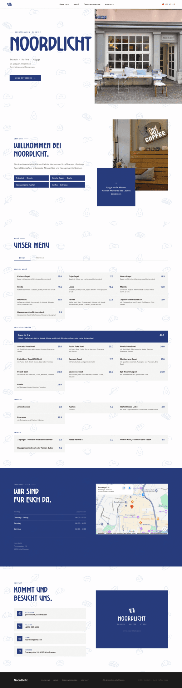
2026Website for Noordlicht — a nordic-inspired café in Schaffhausen. Developed as part of a comprehensive rebranding, the site brings the new brand identity to life online: calm, refined and rooted in Scandinavian simplicity. Clean layouts, considered typography and a visual language that feels as warm as the café itself.
Grade 10 (Spanish GPA, 10 = best)
This is a student project created during my exchange semester in Art Direction. Noordlicht and its owners have no affiliation with this work — all brand rights belong to them. Created for educational purposes only.
Concept & Strategy
A fully responsive website built with HTML, CSS and JavaScript as the digital centrepiece of Noordlicht's brand relaunch — part of a full rebranding. The site needed to communicate calm quality and Nordic warmth — a clear hierarchy of information, smooth navigation and a layout that guides visitors naturally from the café's story to its menu and location. Content architecture was defined first, with each section serving a specific purpose: introduce the brand, communicate the offer, build trust and convert to a visit.
Logo & Mark
Primary & White
Color & Typography
Generous whitespace anchors every section — content breathes rather than competes. The custom Noordlicht typeface carries the warmth in headlines while Inter keeps body text clean and legible. Deep blue is used sparingly as a high-contrast accent, with the off-white cream background setting the calm, airy tone throughout.
Illustrations
Café IconsMockup
Responsive Web Design
The site was built mobile-first — every layout decision starts from the smallest screen and scales up. Navigation collapses to a clean burger menu on mobile, sections reflow to single-column layouts and images are optimised for fast loading across all breakpoints. The result is a consistent, warm experience whether the user arrives on a phone, tablet or desktop.